Apestrong
Brand Identity & Apparel Concept Design
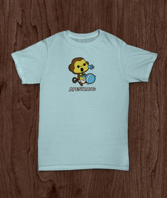
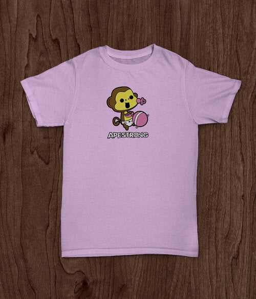
David Lin required a brand identity for his new, start-up fitness clothing line, Apestrong. The brand was focused mainly on the Crossfit community and was to be geared toward fitness enthusiasts, both male and female. As such, he wanted a logo and apparel design that was not too masculine or feminine, but one that would look good for any gender.
Year: 2015 Client: David Lin
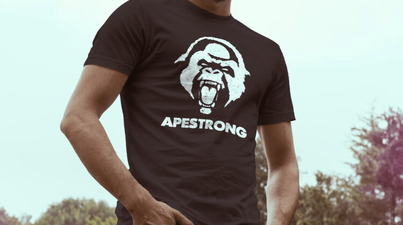
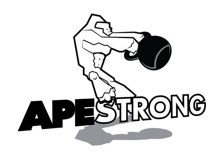
Fortunately, because of the brand name and the client’s wishes, the logo direction was pretty straight forward, and we automatically had a strong image to portray – that of an ape or, gorilla as it would turn out. The project was kicked off by having Mr. Lin complete a creative Exploration Questionnaire. This helped both sides in developing a clear focus for the project. Once this was completed, I went to work researching the brand identity. With information gleaned from the questionnaire, coupled with the research I conducted, I was able to develop some early concepts.
I used traditional pencil and paper sketching for concept development. I find the process of sketching in the traditional way can be more organic and creative in many cases. With constant and clear communication between Mr. Lin and Myself, a final concept was chosen. Lin liked the idea of the gorilla as it portrayed a strong image. He also liked the kettlebell, as this reflected the brand’s connection to the Crossfit community.
I switched to digital illustration at this point, using Adobe Illustrator to flesh out and clean up the design. Once the final design was signed off on by the Client, I went ahead and packaged the whole thing up, providing the design in all the necessary formats for both print and digital applications. Lin finished the project feeling very happy with the end result. I was happy in knowing that I helped design a logo that would help strengthen Mr. Lin’s brand presence, both digitally, as well as on his future crossfit apparel.
© 2022 Anchorpoint, All Rights Reserved
Apestrong
Brand Identity & Apparel Concept Design
David Lin required a brand identity for his new, start-up fitness clothing line, Apestrong. The brand was focused mainly on the Crossfit community and was to be geared toward fitness enthusiasts, both male and female. As such, he wanted a logo that was not too masculine or feminine, but one that would look good for any gender.
Fortunately, because of the brand name and the client’s wishes, the logo direction was pretty straight forward, and we automatically had a strong image to portray – that of an ape or, gorilla as it would turn out. The project was kicked off by having Mr. Lin complete a creative Exploration Questionnaire. This helped both sides in developing a clear focus for the project. Once this was completed, I went to work researching the brand identity. With information gleaned from the questionnaire, coupled with the research I conducted, I was able to develop some early concepts.
I used traditional pencil and paper sketching for concept development. I find the process of sketching in the traditional way can be more organic and creative in many cases. With constant and clear communication between Mr. Lin and Myself, a final concept was chosen. Lin liked the idea of the gorilla as it portrayed a strong image. He also liked the kettlebell, as this reflected the brand’s connection to the Crossfit community.
I switched to digital illustration at this point, using Adobe Illustrator to flesh out and clean up the design. Once the final design was signed off on by the Client, I went ahead and packaged the whole thing up, providing the design in all the necessary formats for both print and digital applications. Lin finished the project feeling very happy with the end result. I was happy in knowing that I helped design a logo that would help strengthen Mr. Lin’s brand presence.
© 2022, Anchorpoint, All Rights Reserved