Palus
Complete Brand Identity Design
Palus Consulting provides ERP technical solutions to clients in today’s high-paced and ever changing business world.
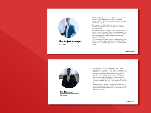
Ryan Vanderveen brings with him years of experience to the ERP field with a perfect combination of quality and speed. Not only a consultant, but also a mentor in the field of ERP (Enterprise Resource Planning), Vanderveen is able to inject himself into any business’ culture to truly understand the challenges and hurdles their company may face.
Year: 2018 Client: Ryan Vanderbeek
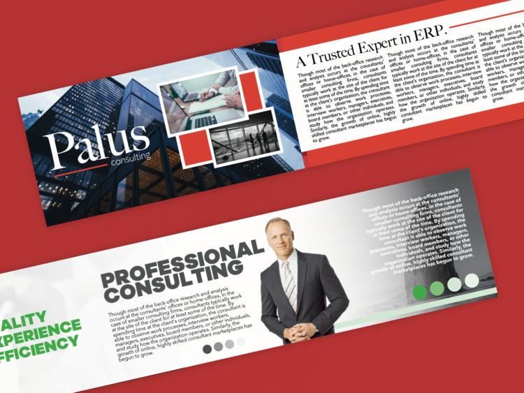
Our main goal with this branding project was to inject a sense of professionalism into the brand. In today’s fast-paced business world, and client’s need for things to be ‘done yesterday’, we knew we needed to project a sense of professionalism, but also some sense of movement and speed, to reflect Palus’ efficiency.
As with all branding projects, we started with our discovery session. I quickly learned that the consulting world is a competitive one and so, we needed to convey an image that said ‘professional’ and ‘mature’.
We developed a number of user personas, as well as some visual storytelling in the form of Anchorpoint’s brandscaping exercises.
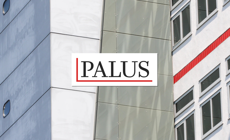
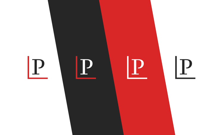
The font chosen for Palus is Questa, a formal looking serif typeface that also has some youthful energy to it. This was coupled with Lato – a sans-serif typeface that also adds some modernity. The icon – a simple red angled half-square represents the cornerstone that ERP solutions provides to its company’s infrastructure. We further incorporated this red line in other deliverables, portraying a sense of movement and speed.
© 2022 Anchorpoint, All Rights Reserved
Palus
Complete Brand Identity Design
Palus Consulting provides ERP technical solutions to clients in today’s high-paced and ever changing business world.
Ryan Vanderveen brings with him years of experience to the ERP field with a perfect combination of quality and speed. Not only a consultant, but also a mentor in the field of ERP (Enterprise Resource Planning), Vanderveen is able to inject himself into any business’ culture to truly understand the challenges and hurdles their company may face.
Our main goal with this branding project was to inject a sense of professionalism into the brand. In today’s fast-paced business world, and client’s need for things to be ‘done yesterday’, we knew we needed to project a sense of professionalism, but also some sense of movement and speed, to reflect Palus’ efficiency.
As with all branding projects, we started with our discovery session. I quickly learned that the consulting world is a competitive one and so, we needed to convey an image that said ‘professional’ and ‘mature’.
We developed a number of user personas, as well as some visual storytelling in the form of Anchorpoint’s brandscaping exercises.
The font chosen for Palus is Questa, a formal looking serif typeface that also has some youthful energy to it. This was coupled with Lato – a sans-serif typeface that also adds some modernity. The icon – a simple red angled half-square represents the cornerstone that ERP solutions provides to its company’s infrastructure. We further incorporated this red line in other deliverables, portraying a sense of movement and speed.
© 2022, Anchorpoint, All Rights Reserved